Business Analytics 5.0

Like most techies, I am attracted to shiny objects. When coding gets dull, get a new editor makes it fun again. Twitter seemed new and exciting when I got my iPhone 7.
And like most entrepreneurs, I imagine inventing something so completely new, awesome, and unforeseen by everyone (but me) that it totally rocks the world (at least for its its customers).
But I have noticed lately that some of the products I am most impressed with are surprisingly not so novel. Trello, for example, doesn’t actually do anything that hasn’t been done before, but for some reason I like using it. Slack (OMG) is the exact opposite of a new idea, but it’s awesome. Why does Atom even exist when there was already Sublime, and why did I switch?
UX
The usual answer refers to user experience, the magic of UX. Ostensibly, the user experience delivered by these products is, in some manner, better that that of their predecessors. But, defining precisely what is better about it turns out to be a bit elusive.
One way I’ve heard Slack described is that it’s not any one big feature or function that makes it so great, but rather, hundreds of small things. Attention to detail. And, as a user of Slack, I can easily agree with that, but one could argue that, based on the number of details to which a great deal of attention has been paid, Microsoft Word is the most awesome product ever. But most people don’t love Word the way they love Slack, Trello, or Atom.
The question therefore is, what makes a new product appealing when it doesn’t really do anything new? It it simply the fact of newness, like a new relationship? Do users change just because the thrill is gone, when there is really no substantive difference? Is novelty itself the attraction?
I don’t think it’s just the novelty. If novelty were enough, there would be hundreds of spreadsheet programs and thousands of word processors (that you’d actually heard of).
Premise: The cost function for software products maps the value and complexity of user tasks to the cognitive friction associated with their completion.
I know that sounds pretty awful but stay with me.
Cognitive Friction (CF) is a phrase coined by Alan Cooper in his 1999 book “The Inmates are Running the Asylum”. Cooper defines it as
“…the resistance encountered by human intellect when it engages with a complex system of rules that change as the problem permutes.”
For example, if you want start an online discussion about a project plan with a group of coworkers. Low CF means that it’s obvious how to do it, and the level of effort is as low, or nearly as low, as possible. Details matter. If the coworkers are people you interact with frequently, they are easy to select. Search has autocomplete. Clicks and keystrokes are minimized. Context is visible throughout the process so you don’t have to remember where you are in the process.
Of course, you expect more complex tasks to require more effort. But sometimes, the problem isn’t effort, it’s pain. Completion of a task is confusing. The steps don’t make sense. They aren’t intuitive. It’s frustrating. If you make a mistake you have to redo work. This is cognitive friction.
When there is a problem for which there is no solution, and one is created, users will tolerate high CF. Alan Cooper cites the analogy between early cell phones and wet dogs — you have to really love a wet dog to carry it around.
But when a new product accomplishes the same things as on old one but with far lower CF it can be incredibly attractive (dry dogs are better).
Business Analytics and UX
I use the term Business Analytics here instead of Business Intelligence because BI is meaningless (apart from being a category for one of Gartner’s least comprehensible magic quadrants). By Business Analytics (BA), I mean the use of analyses to solve business problems, not by analytics practitioners or producers, but by consumers — businesspeople.
The user experience of these consumers is distinct from that of the technicians who oversee the acquisition, transformation, and organization of data. And it is also separate from that of the users of analysis, presentation, and dashboarding tools. Business users consume the work products of these specialists in the form of static reports, interactive portals, dashboards, and spreadsheets.
The problem is that the software vendors who build tools for these intermediaries are focused on the UX of their users, not the end users for whom analyses are prepared. So what happens a lot is trickle-down BA. IT people support core business systems. Data warehouse team slurps up data from various business systems. Data analysts use Tableau, and business users get dashboards built by amateurs. No wonder there’s aren’t a lot of breakthroughs.
Of course some business systems have analytics built in. So if a user only needs data from a single business system, and the built-in features meet their needs, life is good. But more often than not data from disparate sources needs to get consolidated so embedded BA isn’t an option.
Here are Gartner’s 2015 and 2016 magic quadrants for BI tools.
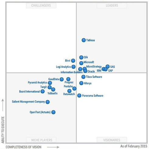
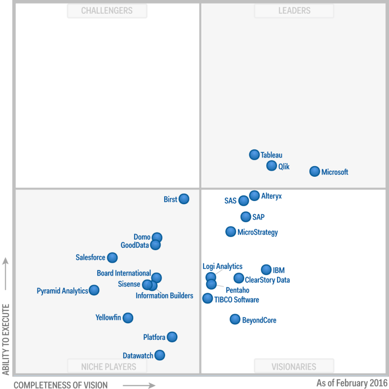
As you can see, there is a big shift away from old school enterprise BI solutions and toward what Gartner terms Self Service BI solutions.
But the primary users of Tableau, Qlik and Microsoft Dynamics are not business analytics consumers. They are intermediaries, often working within user departments, and therefore confused with real business users.
So what have we accomplished in recent years for real BA users?
F#@&^ng Dashboards!
Dashboards are great when employed to make invisible realtime stuff visible. How many users, threads, processes, database operations … active now, in the past few minutes, today.
Most business dashboards I’ve seen recently are the equivalent of putting your historical travel expense details and management approvals next to the speedometer in your car.
As far as I can tell, the reason dashboards have propagated so prolifically is because dashboards are what Tableau and it’s ilk produce, and these are the tools we make available to those to whom we have delegated business analytics.
This is a sorry state!
What next?
If the solutions were at hand, we would be excited about them. They are not, at least not yet. Here are some of the qualities that we think characterize the breakthrough:
1. Autofocus. BA will lead users to relevant data — that which suggests not only the need for attention, but the possibility of action. All sorts of machine learning and predictive analytics are being used to determine what will grab the attention of consumers. The same technology can and should be used to determine what information is worthy of business decision-makers’ attention.
2. Interactivity. It’s easy to explore just about any subject on the web simply by searching and following links. It should be similarly easy to explore the data that describes business activities and their results. This requires some up-front effort to organize and curate that data, but much can be automated, just as search engines and relevance ranking algorithms automate the organization of the web.
3. Real Self Service. Not for intermediaries, but for real decision-making end users. Low cognitive friction. Obvious, intuitive, easy-to-use. If you don’t think this is possible, consider how many people interact with stock market data every day without any assistance from the BI team.
### # *Thanks for listening. Please *
-
comment here
-
or email me: markf at numinary dot com.
-
or tweet @numinary
Cheers!